Touch Screen UI Design Principles for POS Systems
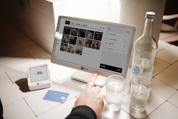
Designing a touch screen interface for a point of sale system requires careful thought about usability in a fast-paced restaurant environment. Here are the key principles we follow in Floreant POS:
Large Touch Targets — Buttons must be large enough to tap accurately even during a busy rush. We recommend a minimum of 44×44 pixels for any interactive element.
High Contrast — Restaurant environments vary in lighting. High contrast between text and background ensures readability in bright kitchens and dim dining areas alike.
Minimal Navigation Depth — Common tasks should be accessible within one or two taps. Deep menu hierarchies slow down service and frustrate staff.
Visual Feedback — Every tap should provide immediate visual feedback so the user knows their input was registered. This is especially important in noisy environments where audio feedback may not be heard.
Consistent Layout — Keep navigation elements in the same position across all screens. Muscle memory is a powerful tool — staff should be able to operate the POS almost without looking after a few days of use.
Error Prevention — Rather than showing error messages, design the interface to prevent errors in the first place. Disable buttons that are not applicable and use confirmation dialogs only for destructive actions.
These principles guide our development of Floreant POS and help ensure that the system works well in real-world restaurant conditions.